
In today’s digital era, mobile devices have become the primary means of accessing the internet for millions of users worldwide. This shift has made mobile-first design a crucial strategy for businesses aiming to stay competitive and relevant. Designing for mobile first is not just a trend; it’s a necessity that impacts user experience (UX) and search engine optimization (SEO) significantly. In this article, we’ll explore why mobile-first design is essential and how it can benefit your website.
Why Mobile-First Design Matters
1. Dominance of Mobile Traffic
Recent statistics show that over half of global web traffic comes from mobile devices. Users are increasingly relying on their smartphones and tablets to browse, shop, and interact online. A mobile-first approach ensures that your website is optimized for the device most users are utilizing, providing a seamless and accessible experience.

2. Improved User Experience
A mobile-first design prioritizes the user experience on smaller screens, ensuring that navigation, readability, and functionality are optimal. This approach forces designers to focus on the essentials, creating a cleaner, more intuitive interface that enhances the overall user experience.

Key Aspects of Enhanced UX:
Responsive Design: Adapts seamlessly to various screen sizes and orientations, providing a consistent experience across devices.
Fast Loading Times: Mobile-first sites are often lighter and faster, reducing load times and minimizing user frustration.
Easy Navigation: Simplified menus and touch-friendly interfaces make it easier for users to find what they need quickly.
3. SEO Benefits
Search engines like Google prioritize mobile-friendly websites in their rankings. Google’s mobile-first indexing means that the mobile version of your site is considered the primary version for indexing and ranking. A mobile-first design can significantly improve your SEO performance.
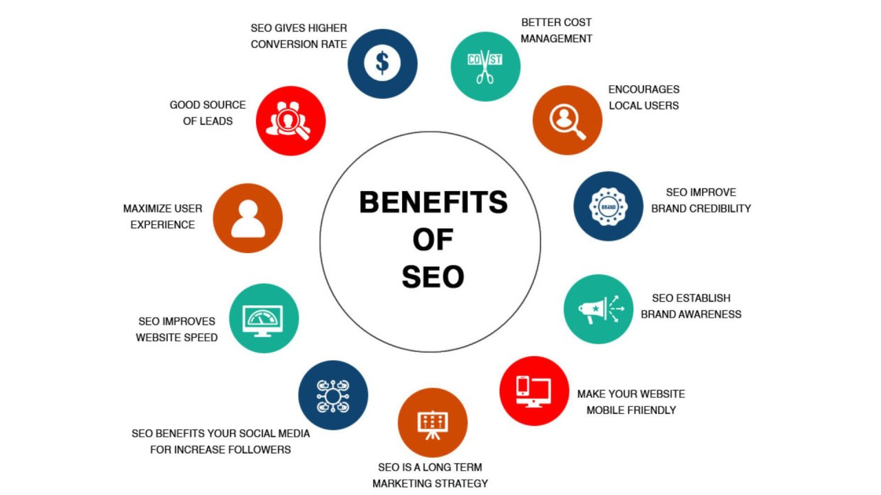
SEO Advantages:
Higher Rankings: Mobile-friendly sites are more likely to rank higher in search results, increasing visibility and organic traffic.
Lower Bounce Rates: A well-designed mobile site reduces bounce rates by providing a better user experience, which in turn positively impacts SEO.
Enhanced User Engagement: Mobile-optimized content encourages longer visits and more interactions, signaling to search engines that your site is valuable and relevant.
How to Implement Mobile-First Design
Transitioning to a mobile-first design involves several strategic steps to ensure that your website meets the needs of mobile users without compromising on desktop experience.
1. Prioritize Content
Start by identifying the most crucial content and features for mobile users. Focus on delivering the core message and functionality clearly and concisely. Avoid clutter and unnecessary elements that can slow down the site and overwhelm users.
2. Optimize for Speed
Speed is a critical factor in mobile-first design. Use tools like Google PageSpeed Insights to analyze your site’s performance and implement recommendations to improve loading times. Compress images, leverage browser caching, and minimize code to enhance speed.
3. Simplify Navigation
Design intuitive navigation tailored for touch interactions. Implement clear, easily accessible menus and buttons. Consider using a hamburger menu to save space and maintain a clean layout.
4. Use Responsive Design Techniques
Ensure your website adapts to different screen sizes with responsive design techniques. CSS media queries and flexible grid layouts can help create a seamless experience across devices. Test your site on various devices to ensure compatibility and usability.
5. Optimize Images and Media
Use responsive images that adjust to different screen sizes and resolutions. Implement lazy loading to improve performance by loading images only when they enter the viewport. Ensure that videos and other media elements are mobile-friendly and do not hinder performance.
Conclusion
In today’s digital landscape, adopting a mobile-first design approach is not optional—it’s imperative. By focusing on mobile-first design, you enhance user experience, improve SEO performance, and ensure your website remains competitive and relevant. As mobile traffic continues to dominate, a mobile-first strategy will help you meet the demands of modern users and achieve sustainable online success.
Embrace the mobile-first mindset and transform your website into a user-friendly, high-ranking digital asset that caters to the needs of today’s mobile-centric audience.