uxx

How to Enhance UX in Web Design

1. Conduct User Research

Understanding your target audience is the foundation of good UX design. Conduct user research to gain insights into their needs, preferences, and pain points.

  • Surveys and Questionnaires: Gather feedback directly from users about their experiences and expectations.
  • User Testing: Observe how real users interact with your site to identify areas for improvement.

2. Prioritize Usability

Ensure your website is easy to navigate and use. Usability is a critical component of UX that directly impacts how users interact with your site.

  • Clear Navigation: Use simple, descriptive labels for menu items and ensure the navigation bar is easily accessible.
  • Consistent Layout: Maintain a consistent layout throughout your site to avoid confusing users.

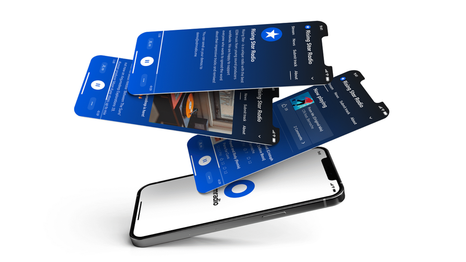
3. Optimize for Mobile

With the increasing use of mobile devices, optimizing your website for mobile is essential for a positive user experience.

  • Responsive Design: Ensure your website adapts to different screen sizes and devices.
  • Touch-Friendly Elements: Design buttons and links that are easy to interact with on touchscreens.

4. Enhance Visual Design

While UX is more than just visual design, aesthetics do play a significant role in user experience. A visually appealing website can create a positive first impression.

  • Clean and Modern Design: Use a clean layout with plenty of white space to avoid overwhelming users.
  • High-Quality Images: Incorporate high-resolution images that are relevant to your content and brand.

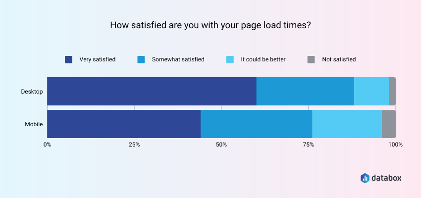
5. Improve Load Times

Fast loading times are crucial for retaining users. Slow websites frustrate users and lead to higher bounce rates.

  • Optimize Images: Compress images without sacrificing quality to improve load times.
  • Minimize Code: Reduce unnecessary code and leverage browser caching to enhance performance.

Conclusion

The role of User Experience (UX) in web design cannot be overstated. A well-designed UX not only enhances user satisfaction but also drives higher conversion rates and builds brand loyalty. By focusing on usability, mobile optimization, visual appeal, and fast load times, you can create a website that meets the needs of your users and achieves your business objectives. Investing in UX is investing in the success of your online presence, ensuring that visitors not only stay on your site but also become loyal customers and advocates for your brand.

The_Mobile-First_Approach_in_Web_Design_banner_001_copy

The Importance of Mobile-First Design: Enhancing User Experience and SEO in Today’s Digital Landscape

In today’s digital era, mobile devices have become the primary means of accessing the internet for millions of users worldwide. This shift has made mobile-first design a crucial strategy for businesses aiming to stay competitive and relevant. Designing for mobile first is not just a trend; it’s a necessity that impacts user experience (UX) and search engine optimization (SEO) significantly. In this article, we’ll explore why mobile-first design is essential and how it can benefit your website.

Why Mobile-First Design Matters
1. Dominance of Mobile Traffic
Recent statistics show that over half of global web traffic comes from mobile devices. Users are increasingly relying on their smartphones and tablets to browse, shop, and interact online. A mobile-first approach ensures that your website is optimized for the device most users are utilizing, providing a seamless and accessible experience.

2. Improved User Experience
A mobile-first design prioritizes the user experience on smaller screens, ensuring that navigation, readability, and functionality are optimal. This approach forces designers to focus on the essentials, creating a cleaner, more intuitive interface that enhances the overall user experience.

Key Aspects of Enhanced UX:

Responsive Design: Adapts seamlessly to various screen sizes and orientations, providing a consistent experience across devices.
Fast Loading Times: Mobile-first sites are often lighter and faster, reducing load times and minimizing user frustration.
Easy Navigation: Simplified menus and touch-friendly interfaces make it easier for users to find what they need quickly.
3. SEO Benefits
Search engines like Google prioritize mobile-friendly websites in their rankings. Google’s mobile-first indexing means that the mobile version of your site is considered the primary version for indexing and ranking. A mobile-first design can significantly improve your SEO performance.

SEO Advantages:

Higher Rankings: Mobile-friendly sites are more likely to rank higher in search results, increasing visibility and organic traffic.
Lower Bounce Rates: A well-designed mobile site reduces bounce rates by providing a better user experience, which in turn positively impacts SEO.
Enhanced User Engagement: Mobile-optimized content encourages longer visits and more interactions, signaling to search engines that your site is valuable and relevant.

How to Implement Mobile-First Design
Transitioning to a mobile-first design involves several strategic steps to ensure that your website meets the needs of mobile users without compromising on desktop experience.

1. Prioritize Content
Start by identifying the most crucial content and features for mobile users. Focus on delivering the core message and functionality clearly and concisely. Avoid clutter and unnecessary elements that can slow down the site and overwhelm users.

2. Optimize for Speed
Speed is a critical factor in mobile-first design. Use tools like Google PageSpeed Insights to analyze your site’s performance and implement recommendations to improve loading times. Compress images, leverage browser caching, and minimize code to enhance speed.

3. Simplify Navigation
Design intuitive navigation tailored for touch interactions. Implement clear, easily accessible menus and buttons. Consider using a hamburger menu to save space and maintain a clean layout.

4. Use Responsive Design Techniques
Ensure your website adapts to different screen sizes with responsive design techniques. CSS media queries and flexible grid layouts can help create a seamless experience across devices. Test your site on various devices to ensure compatibility and usability.

5. Optimize Images and Media
Use responsive images that adjust to different screen sizes and resolutions. Implement lazy loading to improve performance by loading images only when they enter the viewport. Ensure that videos and other media elements are mobile-friendly and do not hinder performance.

Conclusion
In today’s digital landscape, adopting a mobile-first design approach is not optional—it’s imperative. By focusing on mobile-first design, you enhance user experience, improve SEO performance, and ensure your website remains competitive and relevant. As mobile traffic continues to dominate, a mobile-first strategy will help you meet the demands of modern users and achieve sustainable online success.

Embrace the mobile-first mindset and transform your website into a user-friendly, high-ranking digital asset that caters to the needs of today’s mobile-centric audience.